WoW
Things You Don't See Everyday
Deconstructing a Photograph
The third consideration is the frosting on the cake and is the WoW effect. This is what makes a photograph great. The same picture can be taken at the same spot under different conditions with entirely different results. Think about how this lighthouse would look with a flat sea.
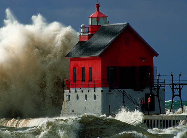
Neither the lighthouse nor the wave is the subject. The subject is really the battle between the unrelenting wave and the "is that all you got" attitude of the lighthouse. All of the little waves surrounding the lighthouse are part of the supporting cast. As is the orange life preserver, now that will really help if you fall off the breakwall. The rip was running all the way to the Coast Guard Station which is a half mile up the river from the lighthouse. These extra little things add detail to the photograph so watch for them.
You can see a man standing just to the left of the life preserver and against the wall in the shadow. He is from the Coast Guard Station and we will just make the guy stand out there freezing because the temperature was 30 degrees Fahrenheit and the wind was steady at 50 mph. All of this will give the photographer great opportunities if you look for them and tough it out. Creating this photograph required standing on the beach for an hour to get the shot so that the wave and the sun on the wave all happened at the same time.
This was a planned shot. I looked at the weather forecast the night before and the forecaster advertised continuous winds of 50 mph on Michigan's west coast. Pack up the tripod, wife, cameras, 300 mm lens (450 mm in DX format), and lots of warm clothes. We left at 5:00 in the morning. We even had 6 inches of snow for the trip home just to make the trip more fun. Was it really worth it, I think the picture does a nice job of answering that question.
What about the WoW. What did you think when you saw this picture. WoW. Simple isn't it.
Definition
WoW is the impact of the picture on your senses This is where you put your heart and soul. Mood, unique subject, relationships, beauty, scary, love, drama, emotion, action, fantasy, etc, etc
What do people want
Some viewers have a strong personal bias component. Some won't like your picture just because of the content so get used to it. Some might even hate the picture just because you took it.
There are safe subjects but some people won't care if you have the most beautiful Bambi shot in the world, they might be thinking of food. Bottom line, you can't satisfy everyone. Try for the people in your circle of business, friends, clubs, etc.
WoW is easily controlled by a limited color scheme; blue is cold, red is hot, yellow is imaginative, white is confusion, black is tense, etc. You can also show something that the average person would not see every day like animals being animals, animals acting human, humans acting like animals, fantasy. Pay attention to interactions and relationships, and on and on.
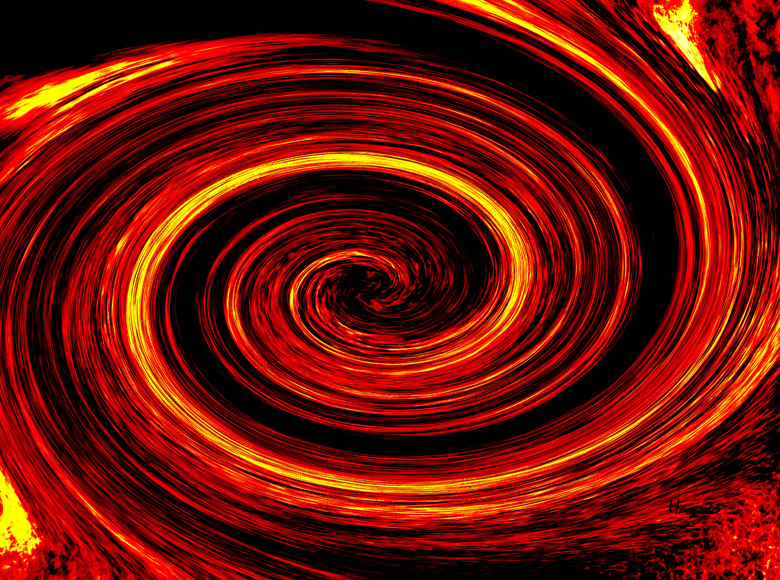
Most people like vibrant color but you have to be careful. A mass of color for color's sake is not what I mean by vibrant color. This spiral example is just playing around to see just how vibrant a picture can become and still be meaningless. Maybe this is what a wormhole out in space really looks like.
Flower photography should show off the flower and the background should be muted. At this point you have a regular great flower shot, but what makes it special? Color that is a little bigger than life will help. A butterfly or bee, water drops, will do nicely. A design in the flower that looks like a face will really WoW.
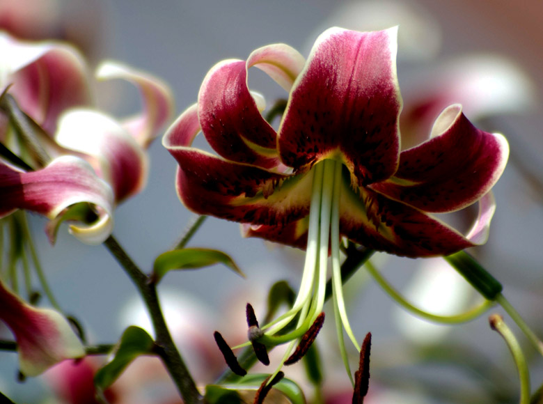
This is a very nice shot of a Scheherazade Lily. That is all it really is, just a nice shot of a Lily. There is nothing outstanding to show some level of WoW. It does meet most of the other requirements such as muted background, it does show off the flower, and the color is nice. I would question the clutter that I have on the left side.
Remember WoW does not have to knock your socks off, but you need at least enough to take the picture to a little higher level. Superb shots will take you up a couple of extra levels.
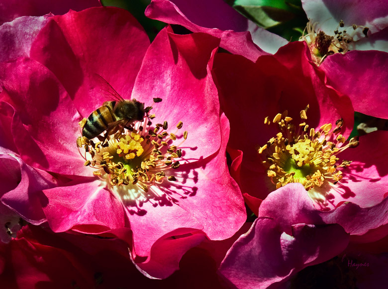
This picture of a flower that I took at Dahlia Hill has a little extra WoW with the bee as part of the supporting cast. The bee is not overly large, otherwise the bee might become the subject. This picture does not have the objectionable junk. I placed the bee right on the rule of thirds upper left intersection. This spot is probably the most used in the United States. In countries that read from right to left then the opposite spot is usually chosen.
No, I don't have a picture of a flower with a face in it. I do have this tulip that is acting like it wants to bite you. Just a little extra action WoW effect.
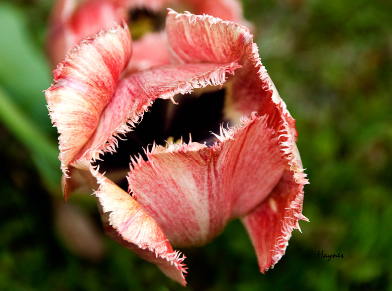
Notice that I placed the picture just a little to the left. The flower in effect is looking to the right so I added a little space on that side. This picture has all of the other characteristics for a good picture, muted background, nice color, something with animal characteristics of a biting action and quite sharp on the front edges on purpose. Surprisingly, these tulips are called frilly tulips, lot of thought went into that.
KISS principle is something to keep in mind. One great picture that comes to mind is the shot of a little boy pointing at a praying mantis and the mantis is pointing back at the boy. This is really what "keep it simple" is all about. The whole shot was made by the relationship between two completely different species. A mantis may be a brutal insect but it is well aware of everything that is going on around it. I have seen pictures of a mantis raising it's arms to scare a predator away, so it is not a stretch to think that the mantis was really pointing back at the boy.
If you take your landscape picture at high noon, making a perfect copy of reality, then don't expect much WoW effect. Photography is/can be part of the artistic community. Make your pictures better than being there.
Catch their attention. The viewers will look twice if they haven’t seen it before. Be sure to have content after you have their attention.
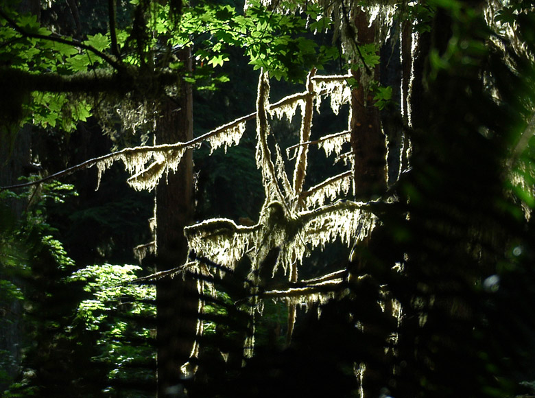
Shots like this are normally ignored by the average photographer. After all, it is not a grand landscape. This picture grabs your attention and there is enough content for you to question what it is. Whenever you are in the deep woods, always look for the sun filtering through the trees and take a picture.
Wherever the light hits the branches and leaves they will turn super bright. The darker background areas stay dark without any special editing because the camera tends to expose for the bright area. On closer inspection, the viewer can see moss growing but it still looks like a primordial forest in the background. Maybe because it is, this is a shot in the Ho Forest, Oregon. One of those magical places that stay rather tropical even though they might have snow a few miles away.
The photograph should be just like a book, it should tell a story. What I mean is you should be able to sit down and write a paragraph or two on what you see in the picture. This approach is not a critique but you should be able to write a story that describes the critical points in the photograph.
If fifty people do the same and all of the stories are essentially the same then you are well on the way. If fifty people rave about the same subject and/or relationships then you have a winner. If fifty people all write a different story then you didn't get your story across.
Not all is lost, some art is interpretive, meaning the viewer can make up anything that satisfies their inquiring minds. For now, just work on creating the same story.
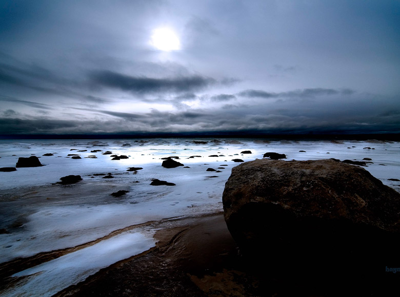
What would you write if you were there.
I'm cold. My wife is not having any fun. I am really really cold. The kids want to know if we are there yet. I'm getting colder. I think I am lost and I refuse to ask anyone. Where is anyone to ask anyway. I am beyond cold but I won't admit it. I will just wait for the kids or the wife to crack. Finally, wife breaks, "I'm cold". OK, we can get back in the car now.
You may not have quite my weird imagination but I think you get the key points that it was cold (about 20 below), and complete desolation. Look how the wind has whipped the snow clean around the rock. This makes the rock part of the total picture. A blue wash helps to make the picture appear cold instead of the winter gray we normally see.
For fun, just go ahead and walk out into the frozen waste from the rest stop on US 2 in Michigan's Upper Peninsula in January. This is the top of Lake Michigan in winter looking toward Chicago, three hundred fifty miles South.
You really do have to be careful because exposure can be a problem. Not camera exposure but the ear falling off type of exposure. If you do wander around for a while and take a shortcut back that didn't work, you can be in serious trouble. I don't think there was an occupied house in twenty miles in any direction.
How do you deliver
Bring your audience right into your photograph. If it is noisy let them feel the roar. If it is snow make them feel cold. If it is dangerous let them feel fear.
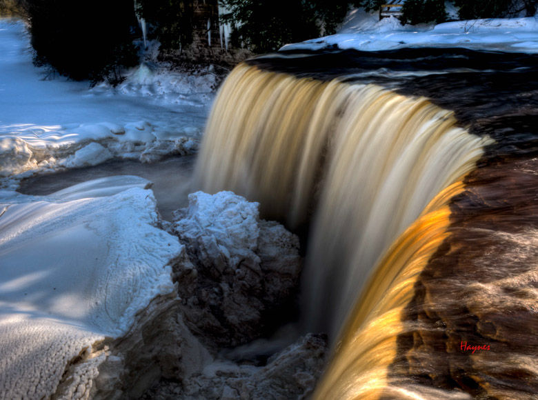
The is a shot of Tahquamenon Falls in the winter. The tea color is from tannin in the water from the great flood plain where Cedar and Oak abound. I used a fairly wide angle and placed the beginning edge of the falls so it became a leading line into the falls. Your eye will follow the edge of the falls to the far edge and then down the falls to explore the other items of interest in this picture.
Notice that the picture has a limited color scheme. The golden color is used to get your interest. The hidden areas like the large block of ice can then be explored in gray. The ice was gray just because of the spray from the falls and it hadn't snowed in a few days.
This is a very good WoW picture. It has a lot of action like all waterfalls. I made the water blur to add to the waterfall's effect. The large block of ice is a unique eye catcher but it is not dominant enough to detract from the waterfall. Even the sun at the beginning of the falls has a nice sliver of golden sunlight to help the eye know where to start. No, I didn't plan that, but I did take advantage of it when it popped out from behind the clouds.
The sky is cloudy here quite a bit. You are ten miles from Lake Superior, and Lake Superior usually makes its own weather. The sky can be bright and sunny inland and here you can have a whiteout snow storm due to lake effect snow.
It is a 3/4 mile hike back to the falls and 100 steps to get down to the falls. It seems like 300 steps to get back up with all of the warm clothes. Keep your camera warm because the temperatures always seem below zero. Your camera batteries will go first and then your camera.
Do a little self assessment
Do a little study on your last bunch of photographs on a hypothetical trip to the Grand Canyon. You will notice that all of your pictures look almost exactly the same as you go to each viewing area and snap your next ten pictures. That is because the canyon is so large that all you see is a background for every shot which looks the same from all points. What makes these shots are what you put in the foreground. You can get off the beaten track and find some stuff to put in the foreground. Be careful, it takes a long time to fall 5,000 feet.
The above nonsense story is not far from the truth if you are a normal amateur. You walk from location to location taking all your pictures from a height of 5-6 feet depending on how tall you are. When I say put something in the foreground, I mean use a wide angle lens and get as close as a foot from some of the foreground objects. Use a high f:stop of something like f:11 and everything will be in focus. Try it. This background and close-up technique will change the way you look at photography.
You can get more WoW out of a shot of a buffalo's eye, wet nose, lolling tongue, and a part of the horn than you can get out of the standard buffalo shot of fifty yards at high noon including the piles of whatever. A buffalo shot at fifty yards will work great if it is thick white fog, the buffalo is covered with snow along with everything else in sight. It will work even better if the buffalo is a white buffalo and even better yet if he brought his buddy - the white wolf. You get the point, it is the uniqueness that will make the shot. If there is lore associated with it then all the better.
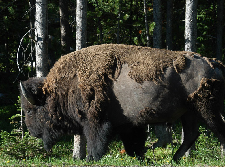
This is an OK shot of a buffalo but it is not great. It is the end of June so they are shedding their winter coat. No white buffalo here, just a shot out the car window on the highway. Try to make your picture at least look like it was taken in the woods. It really was in the woods, just next to the road.
I included this picture along with the white buffalo story so you can see the difference. It really lacks the WoW but sometimes you take what you can get. Who knows, he might have crossed the road and stuck a horn in the side of the car. Then I would have had a tremendous shot.
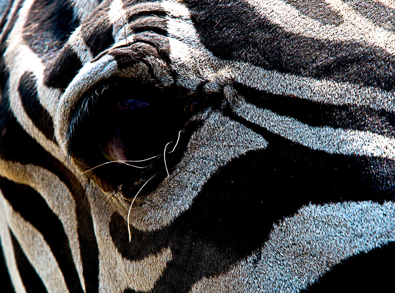
At least I can say I would have been brave like the following zebra shot at a wildlife farm outside of Dallas, TX. The darn thing stuck its head in the window and started sucking on my turn signal. This was not a baby so what should I do next.
Of course, take the picture. I composed so the zebra's eye was on the rule of thirds grid and selected a high aperture. Luckily, I already had a wide angle lens so everything would be in focus, and clicked the shutter. This was all with the zebra's head between me and the steering wheel.
Now, how to get a zebra out of my car? Just take some of the food you bought when you started and throw it on the ground. Simple. Keep your composure, what could happen, he could bite, but he would not eat you, so no problem. Just have fun, plan for the worst, and expect the best.
What did we learn
The WoW factor is just an extension of the other two legs of the photographic stool. They all work together and usually take a little planning. Composition and camera can truly be planned but the WoW opportunity might only be there for a few seconds so be ready.
Editing Aids
Use levels to control exposure, filters to control color, saturation, convert to black and white, and too many tools to mention here
Home