Composition
Things You Don't See Everyday
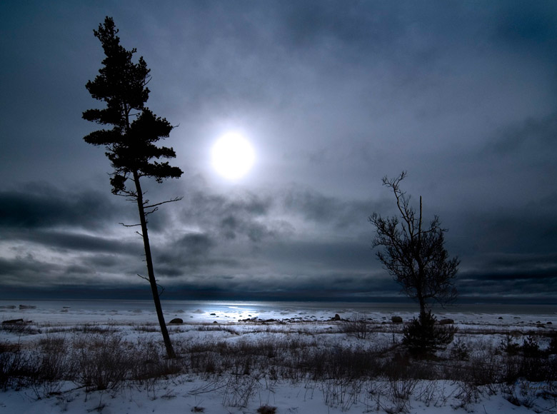
Deconstructing a Photograph
The first consideration is composition. Composition focuses on how the picture elements work together.
The subject of the picture is determined at the beginning of the composition phase. The subject is the focus point around which you will arrange the other picture elements. The subject could be the family dog, a first tooth in or out, the Grand Canyon, or something near and dear that you want to be the centerpiece of your creation.
You must decide on what the subject will be, and the relationships with other picture elements (position, angle, light, time of day, etc). Some can visualize the vision the night before in an easy chair, some need to see the vision in front of them just before they compose the picture.
I have gone back to the same spot many times as conditions change for a completely different look and feel. I did not go back under the same conditions expecting different results.
Definition
Composition is the combining or arranging of elements within the page. Shape, color, size, and relationships are attributes.
The Photographer
You, as the photographer, will need to determine the type of photographer you are. You can be a simple snapshot shooter, advanced amateur with the latest DSLR, or a pro with or without deep pockets.
The second item you need to determine has to do more with philosophy than photography. Are you a "straight" technical shooter with a desire to Xerox the world or are you an aspiring artist where the world and the photograph's appearance have long gone their separate ways.
Your equipment does not determine what quality of photographer you are. Your current camera might be limited but you can still produce excellent results if you understand the shortcomings of your equipment.
Shapes
Lines and Objects
Shape includes solid objects, transparent or semi-transparent objects and lines. Lines include lines in general, the edges of solid objects that have intersected, and the defining edge of a solid.
Horizontal lines show solidarity and peace where strong vertical lines show a strong dynamic aspect. A line may be a horizon and therefore two background shapes will be created. It is important to note the relationship between the two backgrounds when a horizon is present.
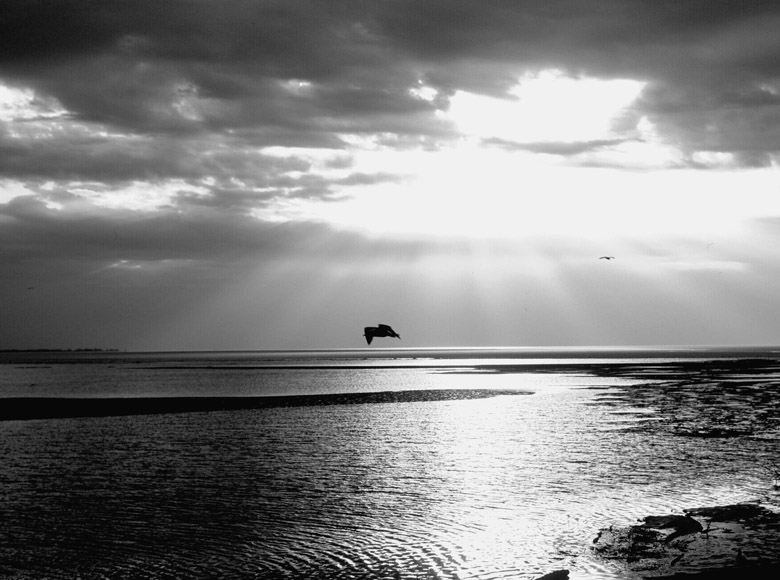
This is a peaceful picture. Lazy gulls coming out of the sun. Light streamers on the horizon. Notice the relationship between the box created by the horizon. Should I put the horizon a little toward 1/3 lake and 2/3 sky or should the horizon line be centered. A sample of this picture where the horizon is 50 - 50 is in the black and white gallery on this web site. They both seem to work for me.
What you don't want is having different things happening in the upper and lower box so that they compete for the viewer's eye. This is not true in this picture no matter where you put the line. The upper and lower portions complement each other. Part of the reason is this is a simple picture as far as picture elements, so it works.
Lines can converge in a vanishing point such as railroad tracks. You must start to think about lines.

This is an entirely different look by just changing the lines in the picture. Notice the cement, the flower bed, the reflective glass, the roof line, and somewhat even the sidewalk all seem to converge at a single spot. I put this spot at a "rule of thirds" intersection point that you will learn about later. If you are in a hurry then just Google it.
Lines can cause all kinds of confusion, distraction, or unwanted distortions. Think of the building in the background that is now leaning backward to the point of falling over. Yes, your camera did that to you, the building is not falling over, but it sure takes the focus away from your subject.

You may want the building to look massive by shooting up at it. But, if the sensor or film plane is not parallel with the building plane then you will get this effect. Back off and get higher so your focus point is the center of the building. Get a ladder but you will probably get arrested or fall off the thing.
Composition 101
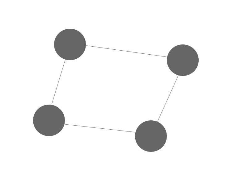
The first example of composition 101 shows four randomly placed solid black objects connected by simple lines. The viewer's eye just follows the arrangement around and around. There is no exit point or no purpose to ponder.
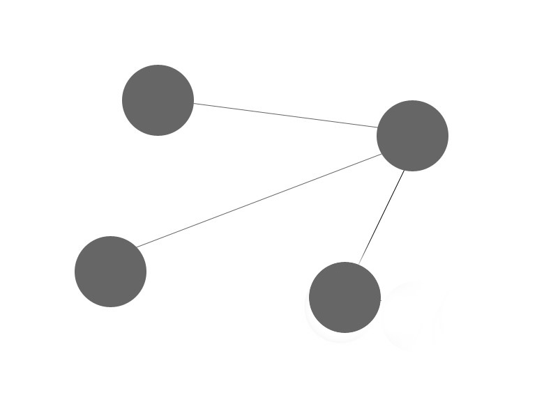
The second example has the same setup for the solid objects but the lines are now focused on the single solid object. The single solid object is placed at one of the rule of thirds intersections. The arrangement is harmonious and is what you should strive for in your photography.

This example kind of messed everything up. I removed a line and made a ball red. There is not as much focus on the upper right ball anymore because the lower ball has stolen most of the thunder. This is what the average amateur experiences from time to time, distraction.
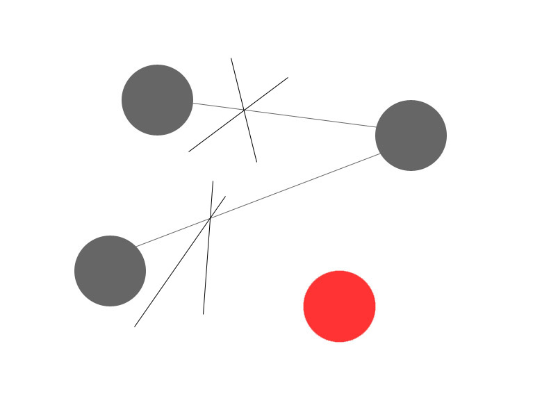
Now I just added a couple of crossed lines. This moved much of the focus off of the red ball and back to the object that is connected by the lines. The focus is still not on the ball in the upper right where we wanted. Oh, what to do.
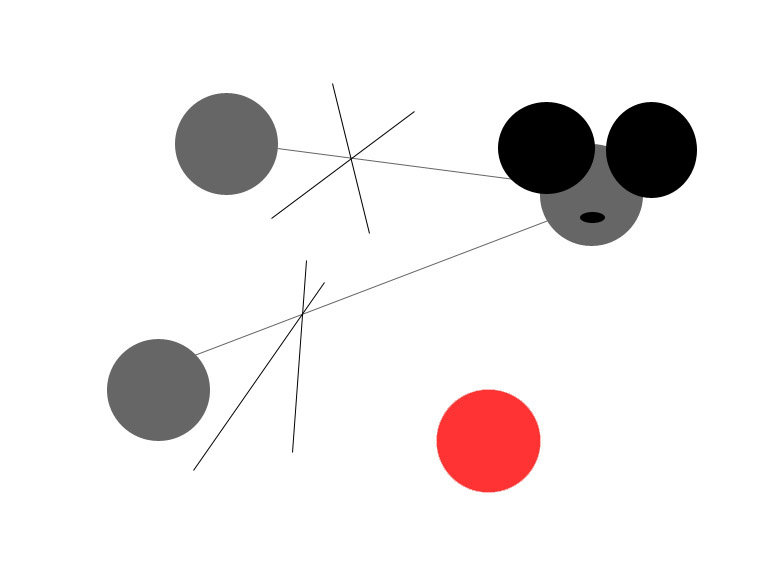
Adding a couple of mouse ears brings the focus back where we wanted it. The red ball still competes but it is not as dominant as when we added it in the first place.
The purpose of this exercise is for you to see just how important shapes and lines are to the success of your photograph. You can easily move the viewer's eye off your intended object (subject) just by adding something colorful. I know, you wanted to add some color. You can add color, just add it in the right place.
It is up to you to figure out the "gotchas" before you click the shutter. Keep everything simple. If you only have a couple of colors and a few elements then things get easier for you and the viewer.
All of the photographic elements have to fit together. Determining what to eliminate in a picture is one of the hardest concepts to learn. I will discuss various ways to make this as simple as possible in the following paragraphs.
Seeing the Light
Danger
NOTE: Do not get clever and point the lens at the high sun. Particularly with a telephoto lens. You will burn your retina for sure. I do a little amateur astronomy with the sun and great care must be taken because the powerful astronomy telescope could leave you completely blind in a second. But, don't think for a second that you can't be hurt with the smaller camera lens. You can also burn your sensor if you are not careful.
Does Light Matter
Light is the first requirement for photography. Composition does not require light, you can arrange elements on the floor in the dark. Introducing light to your composition can change the relationships completely.
Think of example three of Composition 101 when I made the bottom ball red. Now think of a 3-D version of that composition. Let us light the black ball in the upper right corner with a spotlight. The two balls on the left with a subdued spotlight and the red ball without any light at all. I just put the focus back on the intended ball just by using light.
Opportunities
I was stumbling around in the outback one day with my trusty camera and I saw these leaves. It was a thing to behold but it was dark.
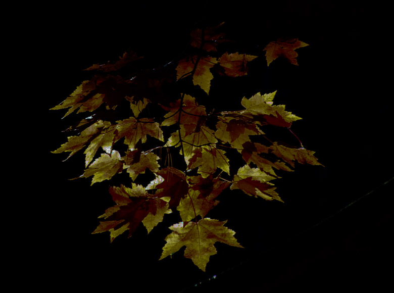
So, I came back when I knew that a little sliver of sunlight would be falling on the beautiful leaves.
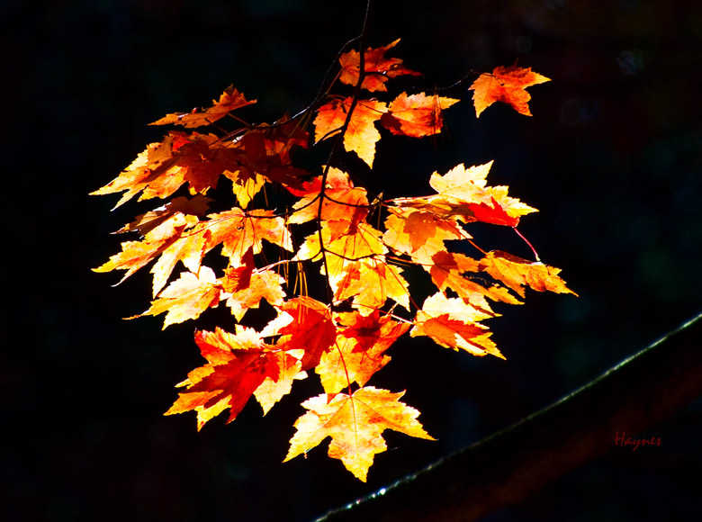
This photograph is very simple in construction. These opportunities are all over if you walk in the real woods on a sunny day. If the sun is shining on something, take the picture. This is the first step on learning how to identify the subject.
There are two things that I want you to take away from the leaves example. First, the background is dark. If it was light then the leaves would have lost the "standout" effect. The real woods is dark even in the daytime if the forest is mature. Take advantage of this to control what you want to show in the photograph. You can show just the right amount of background to your taste, I decided to cut it out completely. Second, is the direction of the lighting. Where is the sun? Is it over my left shoulder as the photographers of yore were taught? No, the sun is slightly behind and to the left of the subject, so the light is shining through the leaves. You can even see the vein structures which adds to the 3-D effect by using backlighting.
It is quite possible that the real subject is in the shadow, but a second opportunity is well lit. Shoot the second opportunity, and then try to move to a second location where the original subject can be seen without being outshined by the other. You may even have to use artificial light or a tripod on the second opportunity. Or better yet, come back when the subject that you wanted is in its best light.
Reality
You can use light to bend reality just by changing the relationship of the light and the lens. Simple example is portrait photography of the human face. Think how many different ways you can light the face. Professional photographers have this down to a science. Strong shadows for the muscular guy, strong wrinkles for the old guy with the pipe, strong almost overexposed face for the fashion model, and soft lighting for the older women so the first frown line does not show.
Reality, I did not come back to shoot the leaves picture in the sunlight. The original picture was the one in the light. I Photoshopped the darker picture for this example. This is not WYSIWYG - photography can be all about how you want the viewer to perceive your photograph.
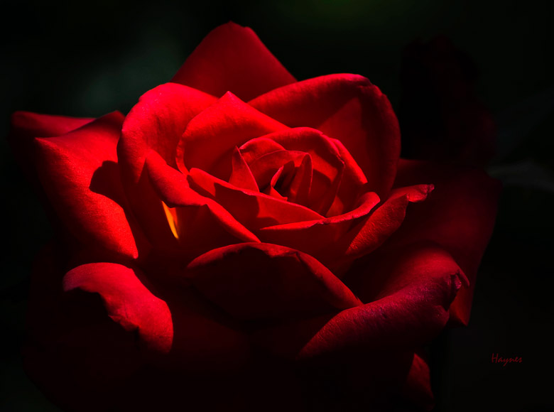
This rose was just a normal well exposed flower shot before I decided to change the lighting and the mood with Photoshop. I used a special RAW tool called the adjustment brush and darkened the rose all the way around the edges. I then used the same brush to lighten the upper right side of the flower. You can see where the sun was coming from the upper right by some of the original shadows but I changed your point of reality. I then used levels to highlight the rose a little further to complete the deception.
Where is the sun or artificial light relative to your composition. Do you want backlight, golden light at dawn or evening, high noon. You can use light modifiers, what is this, more expense. Of course. The first modifier is a reflector that you buy or make with aluminum foil. The second is a diffuser that you can buy or make with nylon cloth from the local cloth shop. You can also consider adding extra electronic lights. You are now in control. You can control the direction of your flash or the sun. You can redirect it, diffuse it, color it with filters or any number of ideas you may have.
Subject
What Makes a Subject
The subject should be the focus of the photo and there should only be one subject. Everything else should support the subject. The subject is probably what made you interested in the scene in the first place. You must compose to show off the subject.
Is that really true. Well maybe. Lets say you are walking along with your trusty box camera and something catches your eye. What caught your eye may have been a single thing, several things, the light, or a grand something.
Remember the light for all of the following scenarios. How you position the lighting is all important as to how you position the elements of your composition.
The Subject as a Single Thing
If the subject is a single thing like a flower then you may want to remove the background by under exposing it, blurring it, or replacing the background with your own sheet of black or white foam core.
Next determine if this subject should be migrated toward one of the intersections of the rule of thirds or centered or somewhere in between. Always have the rule of third grid turned on in your camera.
Where you place the subject is your artistic choice. You will know if you did it wrong or right by moans and groans or wild cheers. Remember the feedback and use it to improve your aesthetic approach.
It goes without saying the subject should be in sharp focus unless you are creating a Monet. Next, check for junk and eliminate it. Figure out how much of the flower you want in the frame.
You may want the entire flower or crop it to the point it appears not to be a flower but a bunch of flowing colored lines. Do you want the exposure the camera determined or do you want to over or under expose.
Using a single subject with nothing else in the picture is where all beginning photographers should begin the composition learning process. You don't have to worry about relationships or much of anything except how big the subject should be and where should the subject be located.
Remember to use the light. If the sun is on the right side of the object then it might make sense to put the subject a little to the left side. Particularly if the subject is looking to the right.
That is all there is to it. Click the shutter.
Read this again until you have embedded it in your mind. This is photography 101.
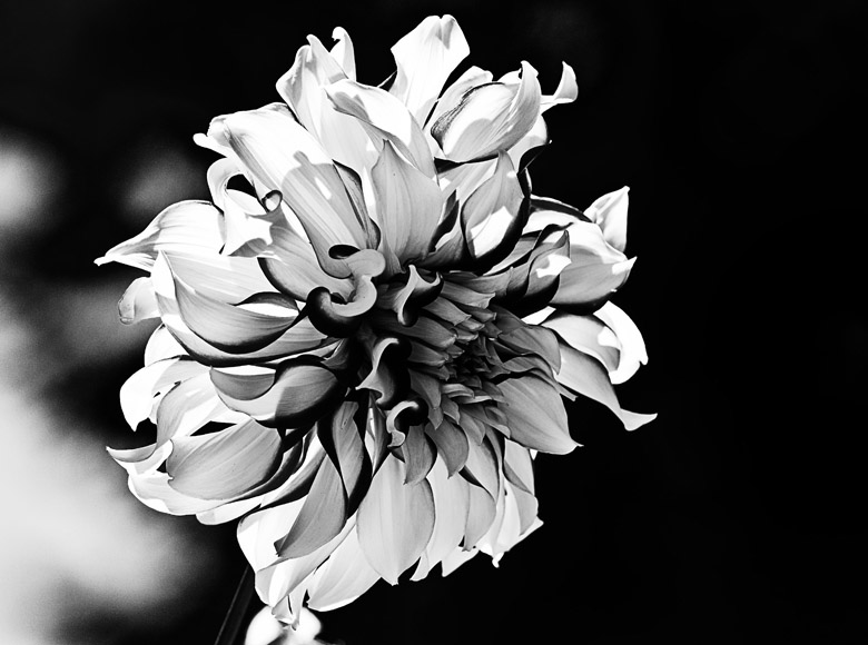
This is a Dahlia in a fine art style. I took this picture just for the beauty of the flower. It shows just the essence of a natural flower with all of the color stripped out. The background is completely gone or blurred. Your eyes can only look at the flower and that is what aesthetics is all about.
The Subject as Several Things
What do you do with several objects that seem to have equal importance. First you have to determine if there is a relationship between the objects. If so, then capitalize on it. Show off love between lovers or the kids playing with the dog. The sun setting on the horizon is even a relationship. You probably would not have thought of it that way but when multiple things get together then there is a relationship.
If it is dark, there is not a relationship between the sun and the horizon. Simple stuff but we normally don't think that way, we just take it for granted. Once you have the relationship established then apply the same rules as a single thing to take the picture.
If there is not a relationship, then you may need to choose. Are the two things competing for the viewer's interest, this is not good. If competing, then you must figure out how to stop them from competing. Move around and look at the picture from a different perspective or look at how the lighting might help.
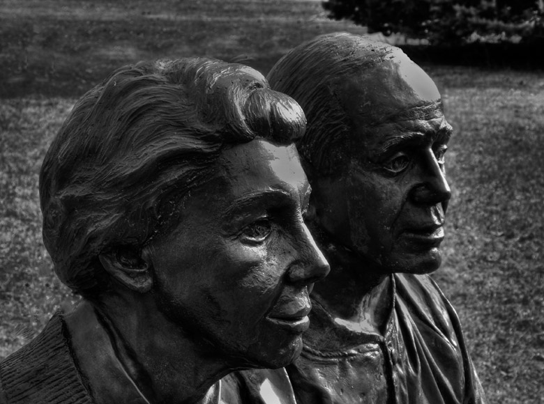
If this picture is taken head on then there is a space between the two people. You can still tell there is a relationship between the two because they are metal sitting on a metal bench. Shooting from the side with a semi-wide angle lens helps eliminate the gap and cements the relationship.
The Subject as the Light
Lighting itself can be the subject of the photograph. Think of the huge red sky with pyramids in the background and a couple of camels in the middle ground. Include an Arab dhow and a few date fig trees and you have the makings of a great photograph. The question is, what is the subject? It can be the sky depending on how dominant you made the other components.
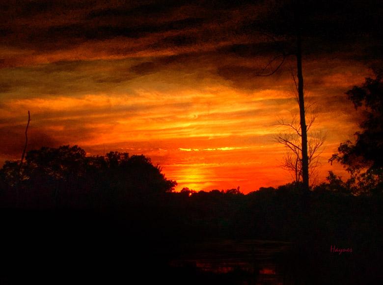
This is not Egypt. This is the Middleville Marsh on an extremely humid night. This is very close to Lake Michigan, so the sky was quite vivid. It was not vivid enough for me so I enhanced it a little, or maybe a little more than a little. The point is that the photograph is the subject or even more, the light is the subject.
The Subject as the Grand Something
Grand "somethings" are typically vast. You need something to set the scale. The time of day can surely make or break the picture. Stormy weather really makes mountains and canyons dramatic. Remember that mountains are lightning magnets and you are nothing more than the highest point. I don't know how Ansel lasted as long as he did.
Move around and find things for perspective. If the light is wrong then come back when it is right. If you are on a tight schedule then include lighting and plan to go when the light is correct.
There is even an iPhone App that will show you where the sun will be on the ecliptic (East to West) and the right ascension (how high). You just supply your locations and the time.
The Grand Canyon is a subject for the entire picture but it really needs some help with something for scale. A rock point with some exotic Arizona shrubs will do an excellent job. Neat clouds and late in the day where the canyon shows detail in the rocks should do the job.

This Grand Landscape picture is of the Grand Tetons from out in the brush. I mean no people around. I am standing next to a log that was about 8 foot long and a foot across. Why is that important? Because, recently a grizzly had torn the thing in two lengthwise just to eat a grub.
I used the mountain wild flowers as something to set the scale for the background. I am sure I could have found a better location, or maybe this was the best location because I am still here. I hate bears when I can't see where they are.
Common Sense
Spend a couple of seconds planning your shot. The viewer will not realize that the subject is the tiny gray dot (little Johnny) on a gray background with 15 or 20 brightly colored balloons scattered throughout the foreground.
If you think that is silly then why do photographers still photograph little Johnny at 50 feet away, in front of the port-a-potty, with part of a car sticking in the corner of the picture, and the parking lot in the foreground? I know you can argue Aunt Hazel took the picture but you need to confess, you will feel better in the long run.
The point is, get close, eliminate the junk and show off the kid doing something important like playing with the dog. Position yourself so that the balloons serve as an exciting background. You can eliminate some balloons or you can make the subject more dominant.
Little Johnny is an easy subject to identify as long as little Johnny is your little Johnny. What do you do when little Johnny is on the soccer field. You have what seems like fifty kids going in every direction. Remember get close, use a telephoto lens, or the zoom on your point and shoot.
One of the major problems is limiting the scene to relevant information. Try to get the photo when little Johnny and the ball are in the same location. This even works better when little Johnny is scoring the winning goal. The picture should contain the ball, little Johnny with determination in his eye, a couple of defenders with resignation on their faces, and the goal, all in a perfect composition.
Easy to do, right. That is why a pro gets to sit where the action is, has an $8,000.00 camera and a $12,000.00 lens, a motor drive clicking away at 12 frames a second, and years of experience.
All you have to do is be successful or lucky once and you can show it off for 50 years, the pro has to be successful every single event.
So how do you shoot like the pro. Look where the pro sits and see if you can get in the general area. The almost huge lenses the pros have are normally just 200 mm, your P&S definitely has that setting by zooming, and most DSLR folks already have something in that range.
The huge Canon white lenses that you see on Golf and other events may be 300 mm or 400 mm. My 70-300 mm Nikkor will get me in the ball-park because on my D300 it acts like a 450 mm, and this lens is tack sharp and under $1,000.00.
The biggest problem you will have is getting enough light. Remember the huge expensive lens. It might have an f:stop of f:2.0 or f:2.8. You have to shoot at f:5.6. That is three whole f:stops (see camera section or Google it) that can be used to boost the shutter speed.
Typically, your camera will shoot at f:5.6 at 1/30 of a second in this situation. 1/30 is not enough to stop fast action. The pro can boost the shutter to 1/250 of a second just because of the faster lens. The pro can also bump the ISO up by 5 or 6 stops without having noise (grainy) problems, and can apply this to either aperture to control depth of field or bump the shutter up a little more. The pros might even have very large radio controlled flash units mounted in the rafters.
So what can you do. Shoot in the daylight or even at dusk. Your little pop-up flash will not make any difference. The other thing you can watch for is change of direction for the action. This will cause a fraction of a second where the actions seems to freeze. Otherwise, you may want to consider a lens that has greater light gathering ability. If you have a DSLR, that may be all you need to change (not the $8,000.00 one either).
Junk
Make sure to remove all intersection of multiple lines which sometime freeze the eye at the intersection point. Remove all distracting elements including any distracting bright or colorful spots.
This means beer cans, garbage, the port-a-potty you didn't see, bright lights, telephone lines, unwanted people, junk that doesn't add to the picture. That sure sounds like a lot of editing, well, just don't put it in your picture then you don't have to edit it out. Look before you click and I mean really look.
Did you want that piece of branch, half of a bird in the sky, the driveway, etc. Figure out the subject and then figure out the things that would support the subject. Then look to see where you have to move to make it all work. It could mean a different lens, get lower, get higher, get a ladder, get yelled at, remember it is easy to ask forgiveness if you get the shot.
You want to capture the viewer's eye for at least 30 seconds. If the viewer is done in five seconds you now have a candidate for the trash bucket.
Color
As mentioned earlier, color can affect mood. The following examples show just how strong color can be.
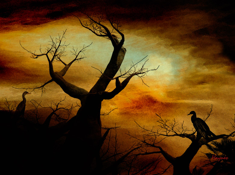
This is pure fantasy land. I call it my resident evil shot. What man would walk over the hill to see what is in this picture? The colors just tell you that something is toxic and you shouldn't be there. The colors are a mix of green, red, and yellow for the background. The entire cast is done is black. Something evil, the buzzards know when food will be available.
Well it really isn't all that evil. The background is of a tungsten light on a Mammoth Cave wall that has been highly modified and blurred. The tree is a fake baobab tree from Walt Disney Africa and the birds are not buzzards - the birds were an Anhinga and a Commorant that were originally sitting on the same branch looking the same way.
Every piece was copied from a different photo and then a Photoshop tool called blending was used to blend the pictures together. This picture would not have impact if the original colors were used. Yes, this is what we call "Photoshopped" in the extreme.
This is a little advanced so I will not discuss the details here but you can Google "blending multiply" and Photoshop to see how to do it.
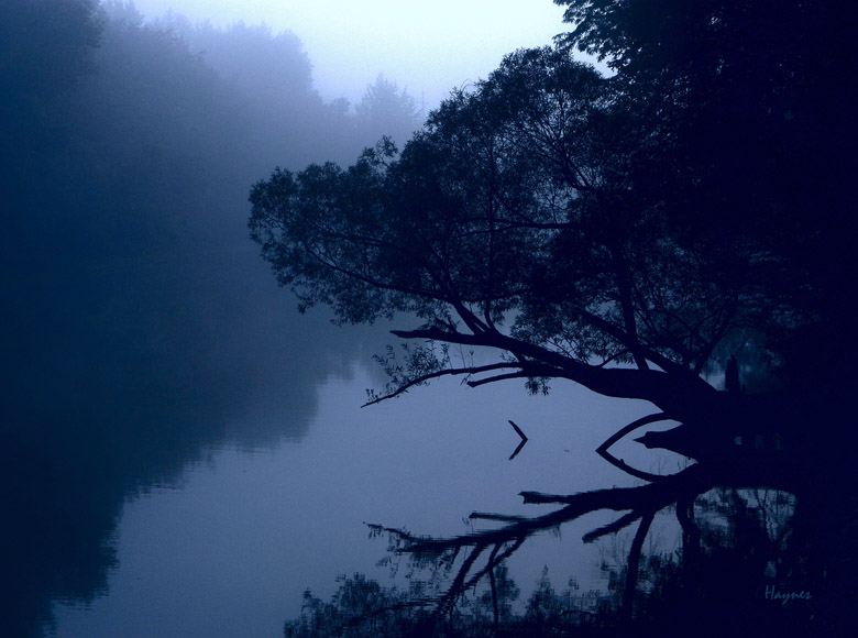
This is a straight shot at dawn on a rail trail. The fog was just lifting and there wasn't a hint of a breeze. The hook for this picture is just what is going on here. Then you see that half of the picture is reflection including on the other side of the river. You just can't see the bank.
This type of picture turns out a little gray so the only real modification is to apply a blue filter so it looks nice, cool, and peaceful.
Size and Relationships
The size of the object can have just as much impact as color. If the subject is tiny it can get lost in the background. If the subject is middle sized and the supporting cast is overwhelming then rethink the relationship. Many things can go into size and relationships including the choice of lens. Wide angle lenses will distort the objects that are closer by enlarging them. Telephoto lenses will flatten the relationship of the objects to the point they seem on the same plane.

This is what a wide angle lens can do. Just get close. Probably 6 feet means close to you. Six inches is what close means to me. This one was taken at one foot at f:3.3. Notice the limited depth of field that makes the subject tulip stand out. The entire picture was converted to black and white and then the front tulip was allowed to revert to it's original color. This photograph was titled "Leadership".
Can you see the rule of thirds positioning. The use of color to enhance the wide angle effect. Depth of field setting on the lens causes the background to blur, and changing it to black and white enhances the "not important" effect.
This "not important" item is an important concept, I didn't enhance the subject, I diminished everything else. People normally don't think in the negative, so add it to your bag of tricks.
Formal Guidelines
Formal Composition
Important formal guidelines for picture organization are Centered, Rule of Thirds, S and C Curve, Leading Lines, Diagonals and Triangles, and Framing. Look to Google for millions of examples. Search for these key words or just use "Photographic Composition" or "Artistic Composition".
What, I'm just a photographer! What is this art thing with formal guidelines? Just like life, you don't need to pay any attention to the rules. They are just guidelines anyway. You can break them if you must but you should know why. In order to know why you broke the rules, you should know what the rules were in the first place.
You need, at least, to know the basics of composition, if you want to be successful. It will make a large improvement in your photography for very little work. These simple rules have stood the test of time long before the camera. You can see them at work in any magazine that has highly paid photographers such as fashion or home design. You can see them in most of my photography on this site, the only part that is missing is the highly paid bit.
It should go without saying that you don't need to have all of the rules in one picture. Just use what is appropriate or none at all if you wish. Remember it is your picture.
Rule of Thirds
Think Tic-tac-toe. Use the intersection to place subjects. Use the lines to organize picture. There are tons of sub-rules that go with this, way too many to mention here. Go to Google - I just did and got 2,410,000 hits.
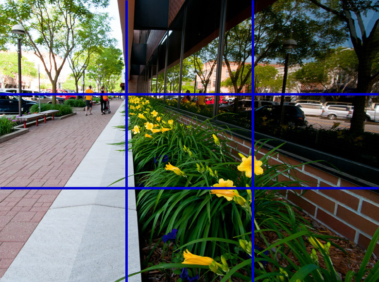
This was a picture that I used previously when we talked a little about the rule of thirds. Well here it is in bright blue lines so it doesn't get lost in the background. Both your camera and your editor probably have the capability to turn on this grid.
You can see how I positioned the vanishing point so that it corresponded with the upper left intersection. You can also see that the left 1/3 of the picture is dedicated to the street. The street is important but there is a more interesting picture in the reflection. You will also notice that the sky line comes right at the 1/3 line even across the reflection.
You don't have to bother to do this type of composure but you will find that your picture becomes more organized and more dynamic instead of chaos around a centered something. Artists have been using this and the more complicated method, the Golden Ratio - See Google, for thousands of years. Even the Mona Lisa was painted using the Golden Ratio.
You can use rule of thirds to place the horizon, trees for framing, ratio of head to body for portraiture. It is a common practice to put the subject or some important part of the subject at an intersection point. Usually the forward eye for a person or animal. Once you turn it on in your camera you will start to think this way and it will become such second nature that you will not even think about doing it.
One of the common mistakes is dividing the picture into two equal parts and then fill the two boxes with equal amounts of stuff. This makes for a very boring picture. If the scene is a beautiful sunset and the ground is black then give the sky 2/3 of the picture and 1/3 or less for the black ground.
S or C curve
Any picture with an “S” or “C” curve will make a good picture. Watch for intersect points. Use vanishing point at intersection. Use rule of third lines to place elements.
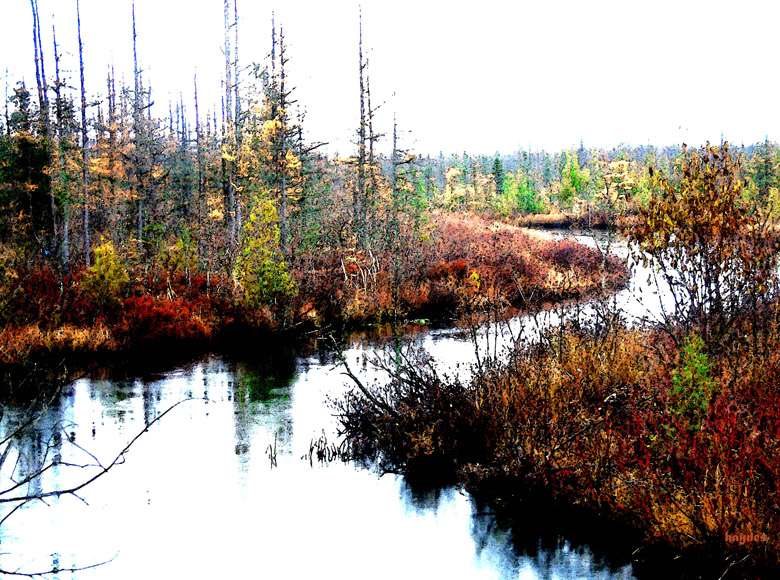
I took this picture in the pouring rain with one of my early digital cameras when it was new. Rain will give you a more saturated picture because all of the dusty stuff on the leaves are gone. Something like licking a rock, yuck, but you get my point. The quality was never sharp so I cranked up the saturation in the editor and then applied a water color filter.
I want to use this picture as an "S" curve example. It will be a pretty good picture just because of the "S" curve. Think what the picture would look like if it were a straight canal. I put the vanishing point at the upper right rule of thirds grid. Also the sky is on the 1/3 line. This type of picture has the possibility of an intersecting line. Look at the intersection of the bottom and the right edge of the picture. If the water's edge would intersect exactly at the same location (corner) then you would have created an eyeball freeze. It is far enough away so your eye does not lock onto the possible intersection.
Centered
Centered - this should be the least used but there are pictures that just cry out to be centered because of symmetry. Especially top to bottom and right to left mirroring.
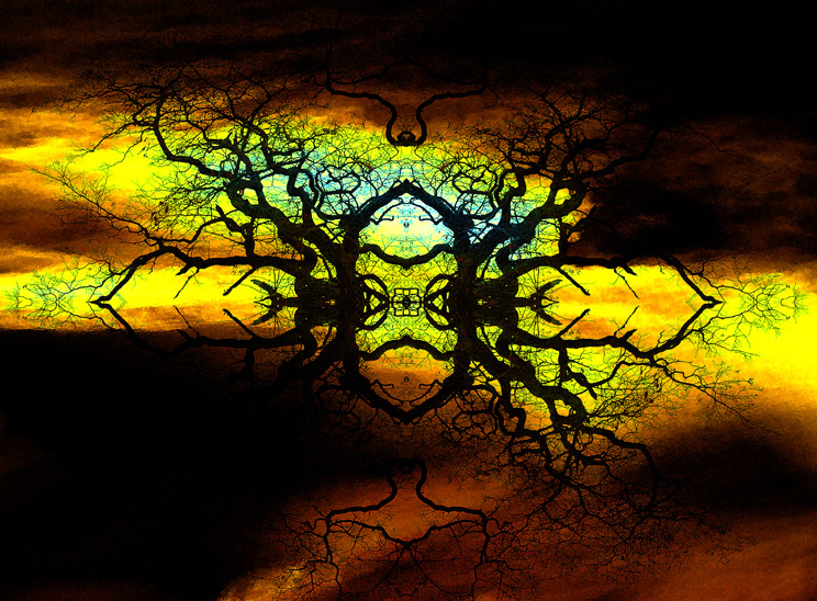
The weird picture of a tree is an example of something that should be centered. This picture is of a quarter of a tree duplicated right to left and then duplicated again top to bottom. The background is a cave wall in Mammoth Cave that has been highly modified and than blended with the mirrored tree sections.
Grouping and Triangles
Photograph animals in singles or groups of odd numbers. It is just easier to organize three objects than two. Two seem to each take up half of the picture.
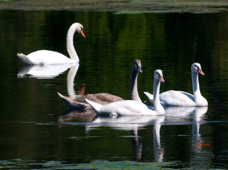
Numbers like 3 almost always form triangles which is a compositional plus.
In this picture there are four swans but there is a group of younger teenagers with mom in the background. So there is really a group of three and a group of one. The rule of thirds also comes into play here, mom is on the intersection top left and the front teenager is on the intersection bottom right.
I wonder if the mother swan is just adoring her brood or is trying to figure out how to drown them without the park ranger finding out. Notice her back is turned away just a little, what did they do now.
Repeating Pattens
Repeating patterns such as fields of produce, hills to small mountains, to bigger mountains, to large mountains.
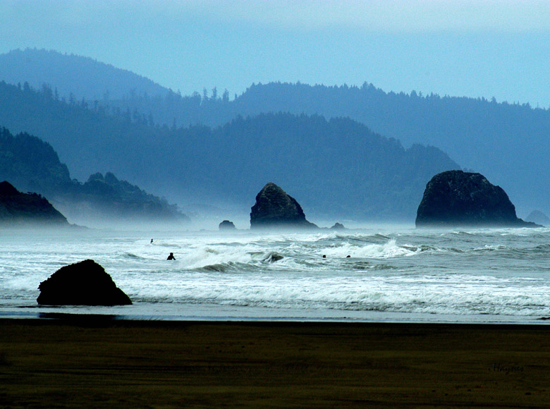
Notice how the single rock turns into bigger rocks. Then the bigger rocks turn into cliffs. Then the cliffs turn into a couple of different size mountains. It just makes the scene for the crazy surfers.
Diagonals
Any diagonals will always look good in a picture. Don't make the viewer dizzy. The horizon line should almost always be horizontal.
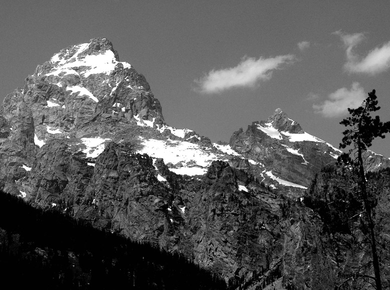
There is one real diagonal in this picture. The black triangle does give some concept of up. But draw a line along the peaks and this forms another diagonal that is parallel to the first black triangle. This really boosts the mountain effect. A little scraggly tree does some scale work.
Framing
Framing a picture works but has fallen a little bit out of favor. Framing means possibly, a tree with an overhanging branch as a frame.
Don't show a few scraggly branches that are not connected to anything hanging out of the sky in the top of your picture. By the same token don't show a tiny sliver of tree on the edge of your picture. Either the whole tree with a little space or enough of the tree if it was huge.
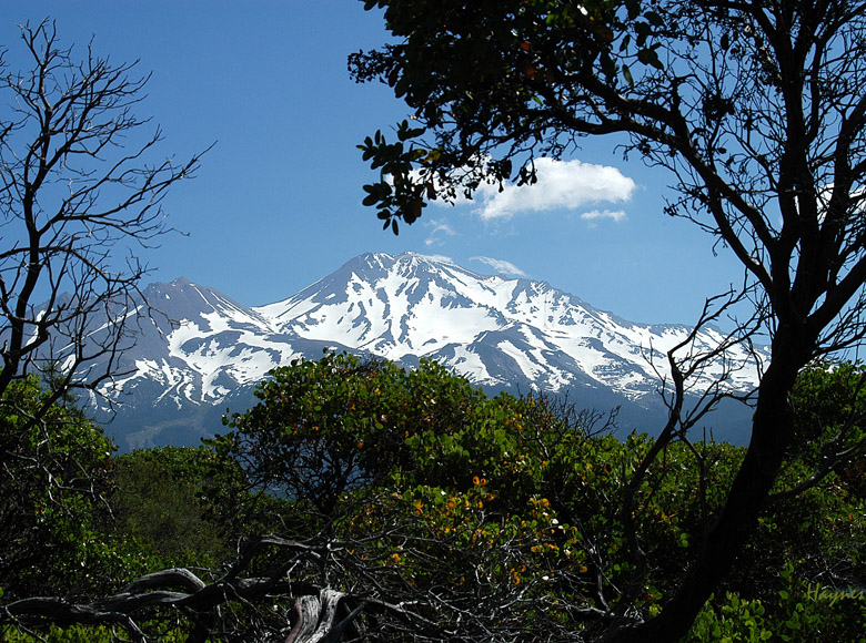
This is Mount Shasta from a deserted logging trail. One eye on the mountain and the other eye looking for mountain lions. You may think I dwell on wild animals a little too much, but if you wander into their territory unprepared then don't complain if you get eaten.
I made the green trees to mimic the line of the mountain but I wanted a little more. I looked around until I found the appropriate gnarly trees to make up my frame. The frame should make you look beyond the frame so don't get something bright and fancy. You will never see the subject.
Foreground, Middleground, and Background
You have three areas to put things; background, middleground, and the foreground. Put the appropriate things in some or all of these areas. A picture can do just fine with only a background if you wish (clouds or a storm come to mind). A scrawny desolate tree can add scale to a shot of a tornado on the great plains. This will scale the tornado but will also show the hopelessness of the situation.
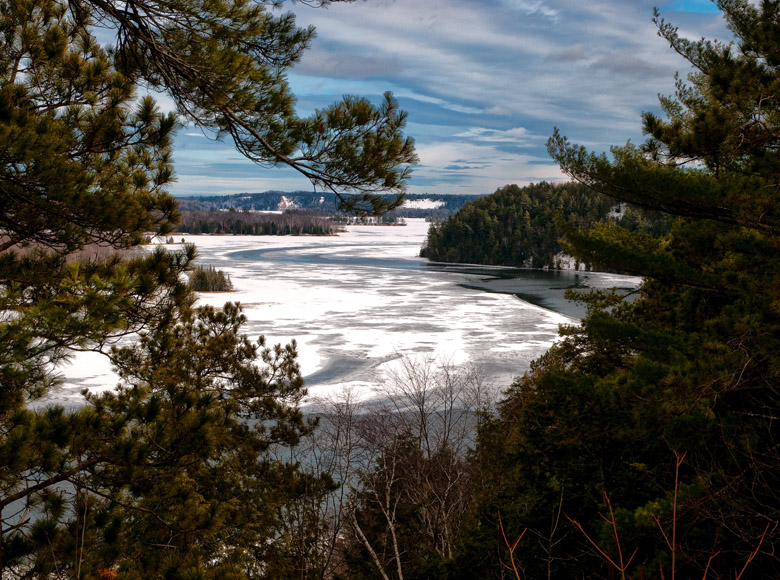
This is a nice scene from Iargo Springs looking over the Au Sable river from a wooden platform caked with ice. I like the trees in the foreground, the river in the middle and the sky as the background. The clouds have similar patterns to the ice. The river forms a nice "S" curve. I set the sky to 1/3 so there would be room for the rest of the picture.
Artist or Technical
Using these guidelines can make an artistically challenged engineer a whizz at creating stunning photographs. Engineers already know the detail, just apply the formal rules as part of the process. Artists already know composition rules but I am sure they found something here to help them.
I had an artist student tell me that she didn't understand that photography can have exactly the same rules as other artistic endeavours.
Which rule? You can get away with just the rule-of-thirds, a sprinkling of S-Curve or C-Curve, a little diagonal would do just fine.
What did we learn
There are volumes of books on composition. Buy a few or go to the library. There are hundreds of visual examples on composition on Google. The idea is that you can use a few properly selected rules to make a vast improvement in your photography.
Remember that you can break the composition rules anytime you wish but hopefully you will know why you did.
Editing Aids
It need not be said that if the picture is junk then throw it away. Camera shake and no content can't be fixed. ISO, exposure, and white balance can sometimes be fixed.
Editing tools that can aid composition are the crop tool to throw away unwanted portions of the picture, the spot removal tool to remove unwanted reflections, and other spots, and the clone tool to remove things like telephone lines.
Home