Introduction
Teaching Philosophy
This site is not intended for high-end photographers, but is for the person that has a DSLR or an advanced P&S and wants to get more out of their equipment. The galleries show what can be done with average knowledge and average equipment. The tutorials give a good overview on what is possible and how to achieve it. This site does not show how to operate a given camera. Camera information that I do include is based on my Nikon experience and does not reflect the slight operating difference you will experience with Canon or other main manufacturers.
The first level approach is to decompose the elements that go into photography into Camera, Composition, and WoW. Yes, I spelled WoW as a mini "play with the letters" composition.
Editing will play the final part in the decomposition, but the first three sections are photography oriented and editing is post-processing.
Camera will show you how to add perspective and mood due to lens choice and other controls. Composition will show you how to organize "stuff" on the page. Then WoW will show how to spice up your picture to the point that people enjoy your photography.
If you are technically oriented without a touch of artistry you can learn to take a picture "by the numbers" with great results. You may not win prizes but you will win praise.
If you are artistic and have a fear of the camera then let the camera do most of the work. You must still understand the camera basics. You will soon realize that the results in your head don't always match the results from your camera. This is because your camera wants to help you. Just understand that sometimes help is not wanted.
Taking a great snapshot is quite simple. You can accomplish this goal just about everytime you take a picture. Right you say. I'd like to see that you say. Well, maybe I lied a little but if you follow a few simple rules you can be quite successful.
1. Choose an obvious subject and only one subject per picture
2. Put the subject somewhere on the page that is meaningful following something called compositional rules. The common rules are rule of thirds, centered, repeating patterns, etc. Just google composition and photography. The three above will give you a great start.
3. Understand that the subject has a relationship to the other elements on the photograph. The simple items are size, color and lightness, perspective, and relationship bonds. For example, if the subject is too small it will not be a subject anymore, if the subject is too colorful and bright then you will not see the whole photograph. Try to organize your photograph by moving around until all of the extra elements support the subject.
4. Get rid of the junk in your picture. Car bumpers, parking lots, porta-potties, beer cans, extra people, branches from no-where, etc. Most important is to get rid of everything that does not support the subject.
5. The technical stuff is pretty simple at this point. To start you can just put your camera on automatic or programmed and get a pretty good boring result. It will be sharp and the exposure will be average but you will have a picture and if you followed the compositional guidelines then you should have a great snapshot. Later, you can switch to aperture priority or even manual.
6. That is all there is to it. Once you can get to this point then the rest of this site will help you create great photographs. They may not be contest winners but you will truly get nice comments from your friends.
Examples
Camera
The camera has a minimal role to play in the making of a photograph. Please don't misunderstand that statement. After all, the camera takes the picture. The camera can offer resolution or sharpness, lens perspective, depth of field elements and that is about it. You can argue exposure, etc, but the editor can handle those items just as well as the camera. This farm duck wild hybrid was about ten foot away on snow. I shot it with a 450 mm telephoto.

Composition
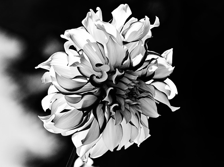
A little fine art type photography is typified by reducing the photograph to the essence of its beauty without clutter. The positioning on the page, the stark image, the minimal color palette all work together to make this a photograph worth exploring.

WoW
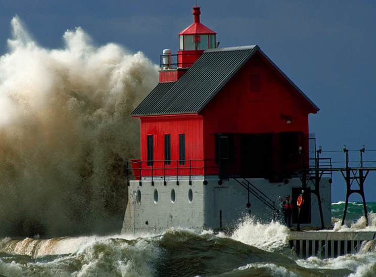
Big waves are big waves but this is ridiculous. The lighthouse is fifty feet tall and the wave is the same height. WoW takes a combination of right place, right time, right equipment, right knowledge, and the right luck. The temperature was 30 degrees and the wind was 50 mph steady. The sunlight was minimal, poking out from between clouds, so the timing was a problem. Trying to get all things together was difficult because it took over half hour of perseverance to get this shot.

Editing
Some day maybe somebody will get a real picture of an alien. Until that time everyone can fake their version in Photoshop.
 Home
Home