Edit
Things You Don't See Everyday
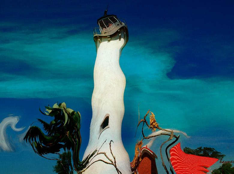
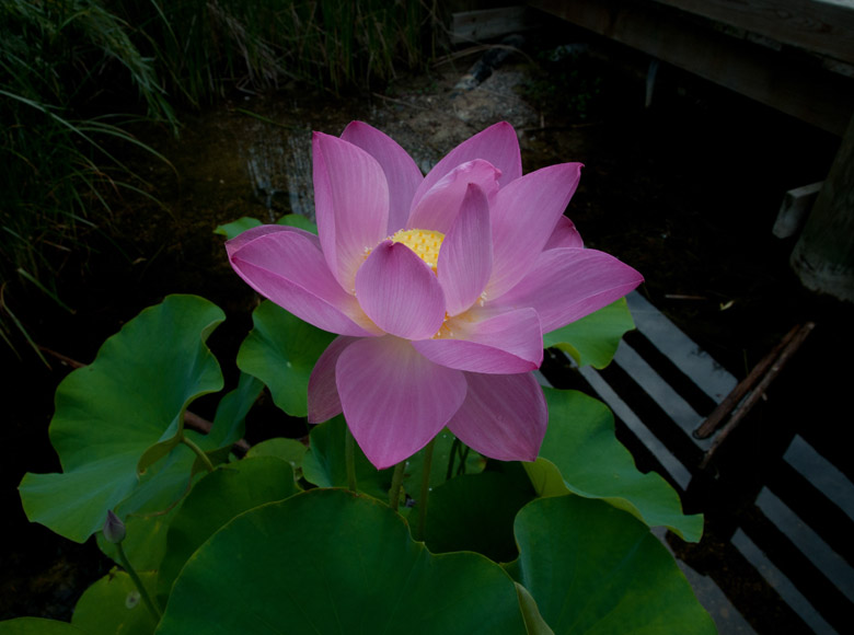
This is actually a picture of the Tawas Point Lighthouse. I got bored one day...
Deconstructing a Photograph
This tutorial is not a quick instruction booklet on how to use an editor. It is a tutorial on how to handle problems and enhance the photograph that you have already been working on.
You have created the perfect picture during the first three steps of Composition, Camera, and WoW. So, why do you need to edit?. Editing allows you to put the cherry on top of the frosting. It is like the cherry pit in the wrong hands. This implies a learning curve. How steep the learning curve depends on the software selected, the background of the buyer, the determination of the buyer, and the willingness to ask for help when needed.
Important - The most difficult thing with any editor is determining what you want to do, rather than how to do it. If you know the "what" then it is easy to do the "how".
If you just poke and hope, then your photograph will degrade a little more with each tool you apply. The "what" is "art", the "how" is "technique". Art requires knowledge and ability, technique requires a recipe and a plan.
Most advanced editors all have the same standard tools. They also have a few hundred extras and options for brand differentiation. Keep in mind that you may only need half dozen tools to do most jobs.
Danger: Do not save your picture as .JPG if you plan on doing more editing. Each time you save, the software will throw away more of your photograph. In Adobe, save it in the Photoshop format. The PSD format will not throw any of your picture's data. I save the pictures I want to keep as Adobe PSD and also as JPG for the web.
Definition
In computer graphics, graphics software or image editing software consist of a program or collection of programs that enable a person to manipulate visual images on a computer.
Composition
Are there any items that you don't want in your picture like a telephone line, beer cans, or unknown background people that you just couldn't remove simply by moving around? Human builders have a knack of placing unwanted objects in many beautiful photo opportunities so work around it.
Are there hidden things that you just didn't see when you snapped the photograph? Blow up your flower picture to at least 100% and look at the little white dots caused by reflections in water drops, dead areas caused by a bug's lunch, light or dark areas that detract from the flower. These will all show dramatically in a small photograph of even 8x10 inches.
Camera
You will probably need to do some editing because the view that you see through the finder is normally not the view that the camera will produce. Some DSLR cameras have a 10% discrepancy. Also, if you are printing, does the format of the camera match the format of the paper? I think not.
Many modern DSLR type cameras use the 2x3 format. They are using the ratio of the 24 mm by 36 mm historical slide film camera. Other older file formats were the 4x5 and the 5x7. The 4x5 and 5x7 were actual film camera negative sizes. Note that the 4x5 is the same aspect ration as the common 8x10 so much of history still persists.
Other cameras like the P&S might give you a big choice of various sizes such as 16:9 which is the common HD TV format, the old TV format of 4:3, 2x3, panoramic and who knows what else.
Just because your camera can do it doesn't mean you should do it. Remember the native size is associated with the sensor. If the P&S gives you a 16:9 format then it is doing an internal crop, hopefully cropping the proper stuff. Your computer can probably do it better.
Every time you crop you may change the aspect ratio of your composition. The minimum damage you can do is move the focus point. If you composed for a 2x3 aspect ratio (standard DSLR) and you have a need to print an 8x10 then your composition may be ruined. Consider taking two pictures with the idea you will crop them two different ways.
Also, consider that you don't have to fit the media size, you can still print a 2x3 aspect ration on an 8 1/2 by 11 sheet of paper. The borders will be a different size but if you are putting it on the wall then just hide that with matting.
I print my pictures using a 13x19 inch printer. This seems to be an odd size and finding standard frames for this size print is difficult but is improving.
A 13x19 is almost a 12x18 which is truly a 2x3 format. The 12x18 has many standard options. Subtracting 1/2 inch for a border, will create a standard size of 12x18 picture with a 1/2 inch on each edge which will help with matting. A standard 12x18 inch mat on the inside is 16x24 on the outside which fits a standard 16x24 size frame. Amazing isn't it.
WoW
A little selective exposure compensation will sure help the WoW effect. The camera applies exposure the same all the way across the photograph. You also will have a gray picture, if you take a picture of fog. without any sun present. A slight blue filter may help your neat gray picture.
How you show off your subject is key for WoW and the editor can sure help. You can under expose your background and over expose your subject if that will give you what you want. The editor can absolutely remove all of the junk that will detract from your photograph and perform the final touch up that is necessary to make your picture shine.
Remember, don't put junk in your picture in the first place, then you will not have to edit it out. Try to make the exposure, focus, and everything else as correct as possible in the camera for best results. Many editing tools are destructive and it is truly best if you don't have to use them.
The Plan
My Plan
Every picture is different, but you should have a plan on how you intend to fix the picture. Once you get better you will develop a "work flow" that you perform every time to fix the pictures.
My work flow is this:
Using the RAW Processor because I almost always shoot in RAW: crop first for my media so I know what my composition work space will look like, fix any color problems, set the white, black, and midpoints for exposure using the histogram, set any color saturation issues, and then do some light pre-processing sharpening.
Using Photoshop; I tweak the photo with levels or curves, I use the clone tool or the spot healing brush, select for any background fixes I want to do such as a gradient to make the sky darker, etc, and then do a final sharpening.
This is the approach I use - if I did a very good job using the camera in the first place, then it only takes a couple of minutes to complete this workflow.
Fix-up Plan
Sometimes things don't work out as well as you had planned. Just remember to blame yourself if the picture is bad.
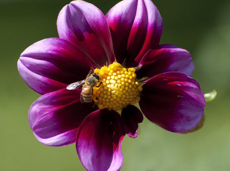
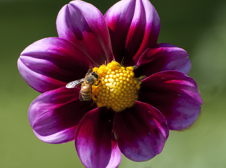
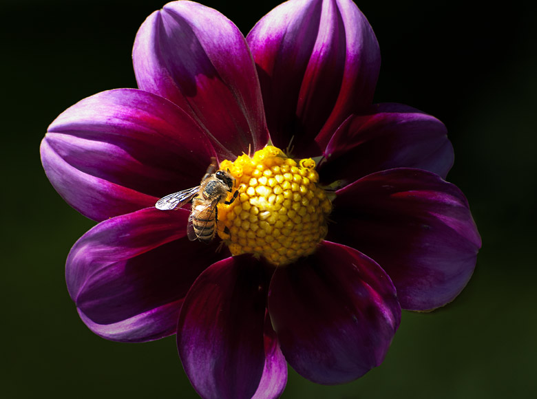
This exercise uses a flower that needs a real plan, so what is the easiest way to approach this. We will just list what is bad in the approximate order you want to fix it. Why approximate, because you will always see a little tweak that is needed. Just don't deviate too much. So, what is bad?
The flower is cut off at the top so I will cut off the same amount at the bottom so it looks planned. Who is to know?
There are two stems that do not seem to be attached to anything and the third stem doesn't do anything for the picture, so they have to go.
The petal on the right seems to have sprouted a leaf plus some black junk so that junk has to go.
There are spots on the petals, you can see the little white dot on the petal on the right. If you zoom in to 100% you will see many other spots that might show in a print.
There is a petal missing. This can't be fixed directly. I can't select it and make it a little bigger, it is simply missing. I can steal another petal, but sharp eyes will be able to tell unless you make it look different. We will steal a petal. If they do not suspect that you fixed it, then they will not take a second look.
The bee was vibrating so it is fuzzy. Even if a bee has landed, it will still be moving, and fast. You can use a higher shutter speed, but I was already at my limit without boosting the ISO.
The background is terrible. The background is blurred nicely and has a reasonable gradient but the color is terrible, so I will try just darkening the existing color.
The flower in general is not sharp. You should always do a final sharpening. Especially if you shoot in RAW because any sharpening done in the camera has been turned off.
There are many minor problems without any major problems, so lets fix it in stages. If you can't define what you expect to do to fix the problem, then maybe the photograph can't be fixed. If the photograph has important content then archive it. If it was intended to be just another beautiful picture, then throw it away. Do better next time.
I am going to use tools without a lot of explanation on how they work. If you are unfamiliar with the tools then Google the "tool name" to see how to use them. I am using a standard set of tools that are used all the time. It would be advantageous for you to learn to use this set plus a few more for exposure, saturation, hue, white balance, etc.
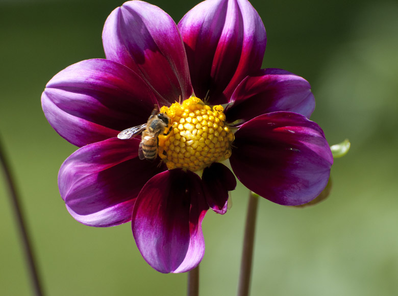
This is the original picture - as you can see it really needs a lot of minor fixes, but we have our plan.
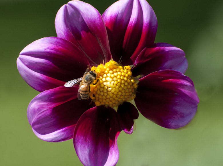
The first step was to hide the mistake of cutting off the picture in the first place. The correction is pretty simple. I used the "crop" tool to cut off the bottom so it looks natural. I tend to use the preset values with the crop tool so that my aspect ratio is maintained. So I put 19 for width, 13 for height, and 300 for resolution. Remember, I use 13x19 paper, you need to put in your media choice.
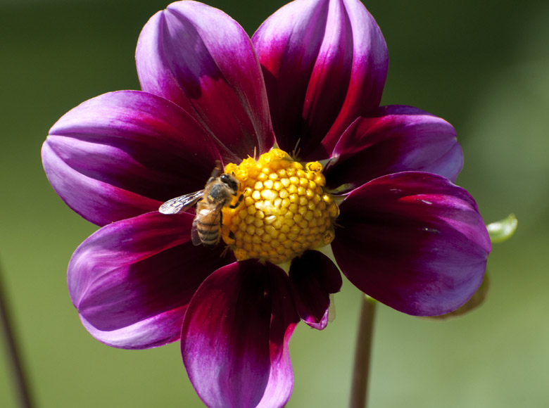
Next is the "clone stamp" tool and I will set the "copy from area" just to the right of the stem as close as possible. This is so, as the background changes, so does the result. Here you can see part of the stem already fixed. I used a "brush" about half again as big as the original stem.

Here is the end result. You can see that the gradient background matches all the way to the top of where the first stem was. This was a good job because you really can't tell something was removed. This is a tough tool to master so if you screw up then go to the history and start over.
The other stem has been removed using the same technique. It looks a bit more messy then the first clone action. I could fix it but I am not going to do anything. It is all right because I will cover that spot with a new petal anyway so I won't worry about it. Also, the rest of the mess will disappear when I make the background darker.

I removed the extra stuff sticking out of the petals on the right continuing with the clone stamp tool.
I blew the picture up to 100% and removed all of the little spots with the "spot healing brush" tool. Make the brush size about 25% larger than the area you want to heal. This is an amazing tool.
You will notice that the little white visible dot is gone on the lower right petal, along with 20 other imperfections that were too small to be seen here. They would be seen on a print, so they are gone just out of habit.
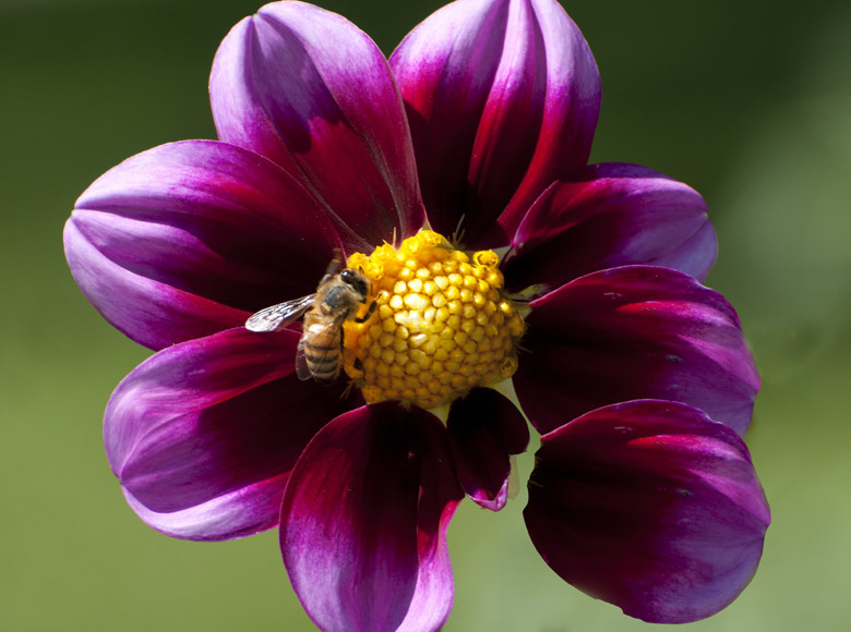
I used the "magnetic lasso" to select around the petal above the one that is floating. Once it was selected, I did a copy and paste in place. Then I used the "move" tool to move the petal off the original petal so you could see it.
Next, the "free transform" tool is used to resize and rotate the petal. I then just moved it to it's new home. Notice how it looks fake because the markings are the same as the original petal and it doesn't look like it is connected.
I used the clone tool again to copy some of the yellow center over the petal where it should be connected. This way it looks like the yellow center just grew over the petal. Next, I used the clone tool to make the petal look different, including fixing the little notch that was on the top edge.
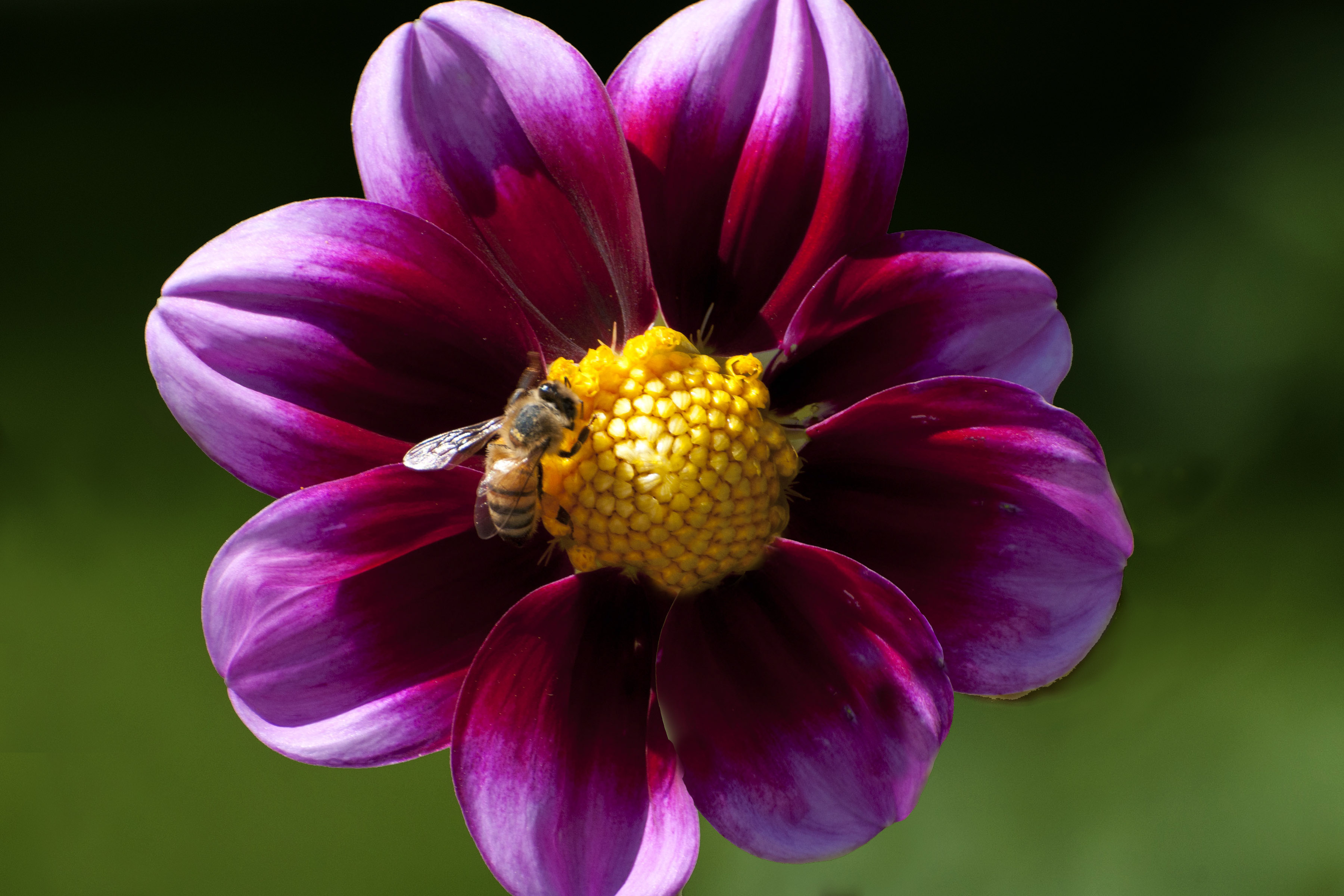
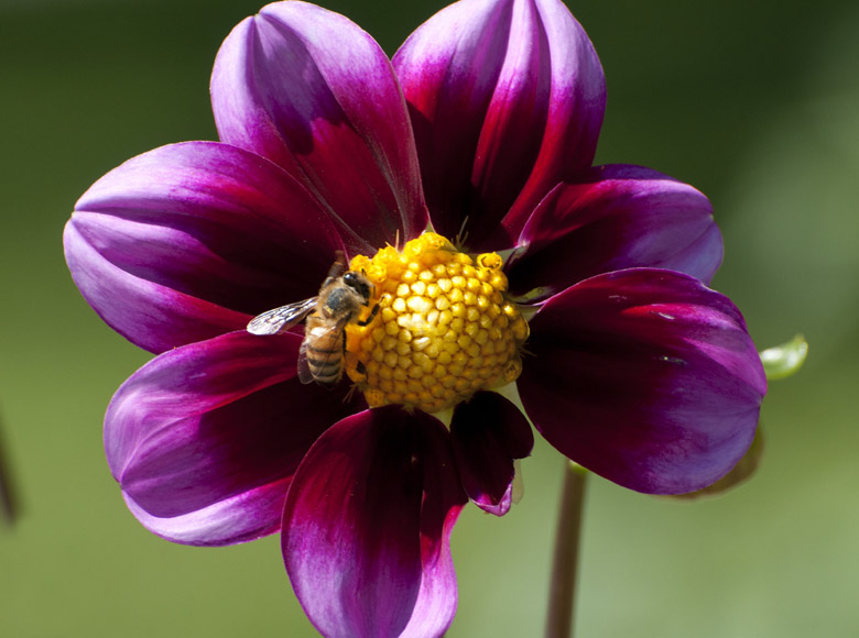
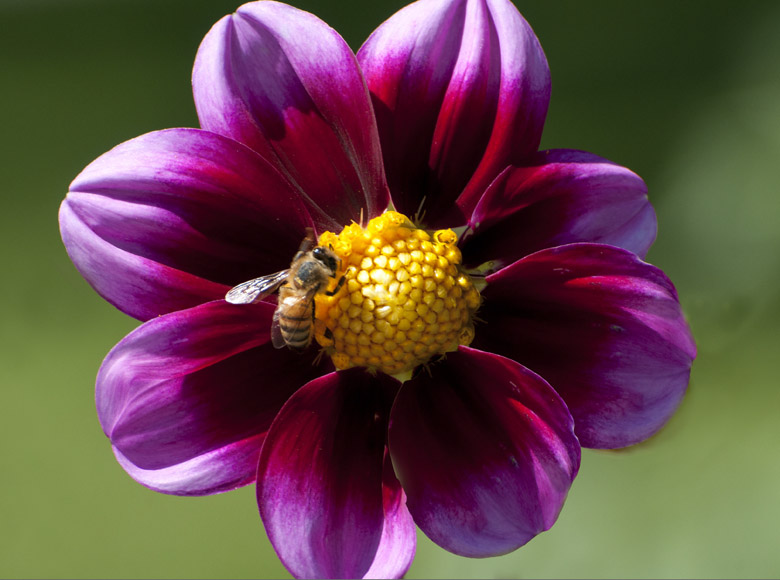
I used the "quick selection" tool and selected the total background. I then used "levels" to set the color a little darker. It is still the same color, I just made the background darker, not the flower. I could have made the flower a little lighter if I choose just by reversing the selection. I just wanted the flower darker also. You can see a nicer green and the poor cloning job has all but disappeared.
Next, is the pesky bee, that would not stay still. So I used the "polygonal lasso" tool to draw a loose selection around the bee. I made the selection so loose that there was not a defined line and then used the "unsharp mask" tool to sharpen the bee back to normal. When I do the overall sharpening the bee will become over sharpened but that is part of the solution with the buzzing bee.
Last, I used an advanced sharpening method called "high pass filter" to sharpen the whole picture so that the flower was correct. I used the "overlay blending" option if you want to try this. Now, the bee is a little over sharpened, but it is not vibrating anymore. The over sharpening is not overly visible because it is such a small area. So, I will consider the problem solved.
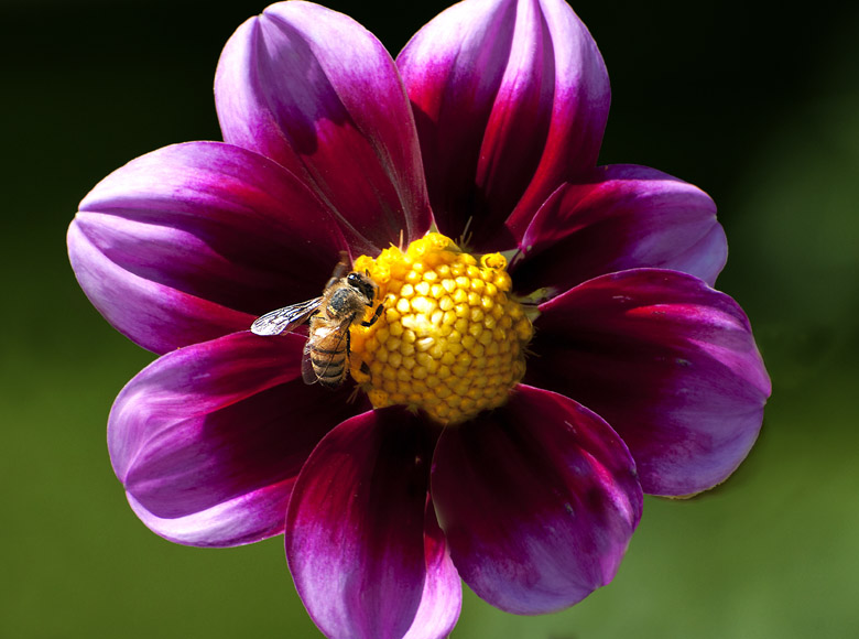
Let see if we can make it a little more dramatic. Remember this is the same picture we started with but it has a whole different look and feel.
This is accomplished using the adjustment brush in CC Camera RAW. Sorry folks, this is a CC tool only. I want to note that the CC Camera RAW tools are available even if you open up a JPG file. This is not true in Elements Camera RAW.
Anyway, the adjustment brush will allow you to use all of the Camera RAW tools in a selective manner. Just set the brush radius, I set it at 20% of the picture in this example, and select the portions of the photograph that I wanted to modify. I selected the area at the top middle of the picture and selected clockwise all the way around to the bottom left corner. I just changed the exposure until it was almost dark. Then I select the top left part of the flower with a new selection and lightened it just a little so it looks like the light is coming in at that angle.
You can change the picture to black and white just by de-saturating the picture. That really doesn't work very well and is not the recommended method. You will be limited to what method your editor offers. Do some work and find the best method using Google for your tool set.
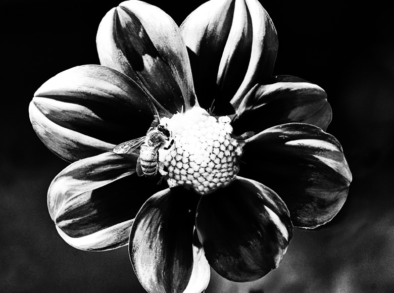
I wanted a very high contrast, almost charcoal look, so I used a product from NIK software called Silver Efex Pro. If you choose black and white there are many different effects you can apply using Silver Efex Pro. I happen to like the NIK products, it is a "plug-in" for Photoshop. NIK has half dozen excellent tools in the suite. NIK products will also work with Elements, Lightroom, and Aperture.
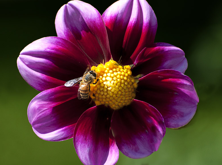
So there you have it with the overused flower example. We recovered it from the trash can and then created four different views of the same flower. Not bad for a few minutes work. This shows the power of the editors. Sure they have been "Photoshopped" but they look better than the original and they don't look overdone like most "Photoshopped" pictures. For example, the black and white photograph could have easily been done in the wet darkroom.
Before and After
The following pictures are groups of before and after shots. The before shots are just OK. I just fixed them using different methods to start your brain thinking about what you might do with some of your photographs.

The problem is the rope fights with the pulley for dominance. The black pulley just does not do well with the brown rope even if I crop out most of the rope.

I decided not to deal with the brown rope. I got rid of a fair amount of rope so I could show off the more unique pulley. Rope and pulley go together but I don't want the rope to think it is more important.
So I just converted the whole thing to high contrast black and white to get rid of the dominance problem.
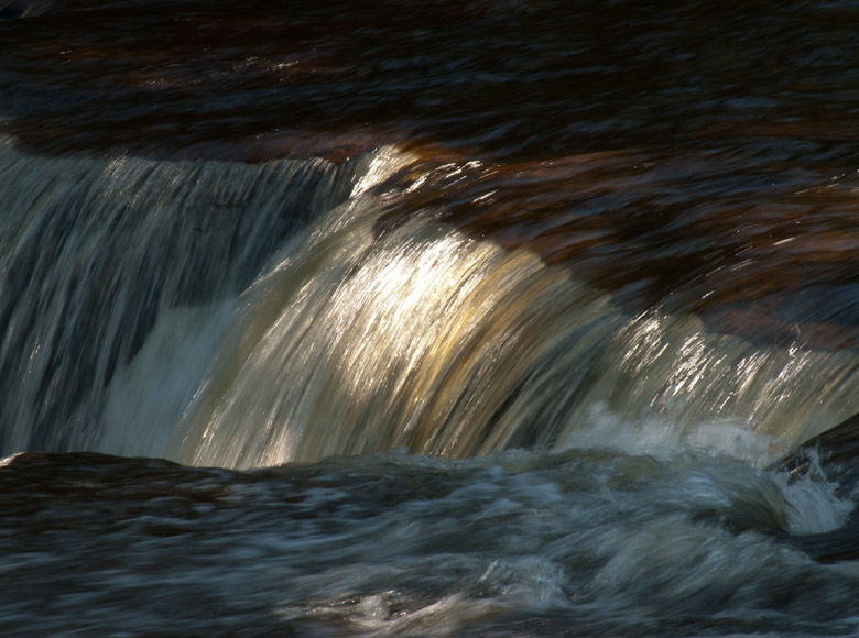
This is the lower Tahquamenon Falls. This water is noted for its strong tea color from the tannin in the water. You can see a little of it. The foreground is too big along with the black at the top. Between these two items, half of the picture is used up.
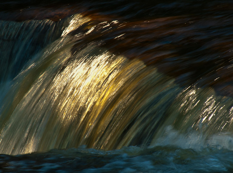
I want to show off the golden tea color, so I just turned up the saturation so that the brightest area was properly saturated. Next, I just cropped it so that the lightest spot was at the upper left rule of thirds intersection. Simple, and effective.
Oh, the poor bird. I had a 105 micro lens with me and it just wasn't long enough, no matter how far I leaned forward. I left some tin at the top of the picture that is really a mess. I don't need as much foreground. There is another bird's tail hanging out of nowhere. That I would have had to fix anyway, even if I would have had the right lens. The stick is dull as a stick and needs a little magic.
I will start with the crop to eliminate some of the foreground. I want to leave enough foreground so that the limb the bird is sitting on has some connection to the real world. I cropped as much as I could off the top to get rid of the tin roof. It was necessary to crop out the tail of the bird or the head. I opted for the tail. I used the clone stamp to get rid of the tin and the other bird's tail.
Now for the magic, and you probably won't be able to do it, because it does take CC. It is also a concept that not many people know about, so here goes. I converted the scene to "mode" LAB color. This method makes a black and white image, L channel, plus an A channel and a B channel. The A channel controls the green and the magenta hue. The B channel controls the blue and the yellow hue.
Now, the neat stuff, I can use curves to modify the A and B channel separate from the L channel (lightness). I can use curves to change the hue relationship by 10% just by rotating the hue line by pulling the top slider to the left by 10% and the bottom slider to the right by 10%. Notice this did not effect the middle hues at all. I do the same thing for the B channel. Then I went back to the L channel and used curves to modify the contrast. Then just put the mode back to RGB.
It deepened the color of the bird and even brought the grain out of the wood. This method really works well on rock cliffs. I have not tried doing this with hue in RGB. It may work but the exact controls using LAB color sure wouldn't be there. Also, changing the hue in RGB will also change the tonality so it might not work very well.
This picture is very pretty if we talk about the flowers. It is terrible as a picture. This was total brain freeze. I took it with the 105 Micro and I could have gotten as close as an inch. Instead, I stood back at least three or four feet. Anyway the fix is obvious, get rid of the negative space. Boost up the saturation that RAW does not show.
The crop is completed and the saturation is a tiny bit more than real life but it is my picture and I want it that way. This picture calls for no background and centered.
This is another picture with the 105 Micro. I guess I just love that lens. It is so sharp over the entire range. I could not get any closer to this flower. I could never find out what it was. It was early in the day and the sun was doing a strong backlight. I also need to crop to get rid of the junk.
I did the crop so the flower was centered. I did just a little saturation but I thought this picture needed a little more. I used a different NIK product called Viveza 2 so I could control what I wanted to do. I wanted the core of the flower to really shine. Viveza 2 has a command called "structure" and it made the veins in the flower visible and then I saturated them to my taste.
The Fix Summary
I have shown you various levels of fixing things with editors. The first flower, with tools most editors have. Then I added some additional functions by using some NIK plug-ins. I showed you a very advance technique with LAB color and an advanced technique for sharpening called high pass filter. I even showed you how to make a glow and introduced you to blending modes.
So have fun with editing and editors. I suspect that if you start with a basic editor you will graduate to something better very quickly. I recommend learning Photoshop Elements.
Which Editor
The average snapshot photographer does not edit all all. The presentation media is a small snapshot on a Facebook page or a cell phone. A little exposure fix and a crop to eliminate some background might be in order for these simple use photographs.
Almost any simple editor will be able to accomplish this task. If you use a Mac then iPhoto will solve all of your problems without a lot of additional knowledge. Look for the crop tool, exposure, etc and you will do just fine. If you want simple editing then consider the tool that came with your camera. If you bought a Canon then you will have an editor that will do just fine. Consider Google Picasa or even Windows Live Photo Gallery.
If you want a simple all-inclusive program then consider Adobe Photoshop Lightroom 5 at $235.00. This program is an excellent straightforward editing program, library management, slide shows with fancy fades between pictures, print management, and a web gallery generator. This is all accomplished without the steeper learning curve associated with Photoshop.
Aperture is the Mac-only version which is a combination of RAW processor type tools, Lightroom type tools, Adobe Elements type tools, and some unique tools all combined into one program. This program has simple to complex tools, but you can produce great results with any bookstore Aperture how-to book as an aid. The cost is under $200.00.
Photoshop comes in two versions two different ways.
There is a version for the Mac and one for the PC. You need at least a little horsepower from your computer. So if you are one step above DOS then you will have some problems. Look at the requirements before you buy. If you plan on buying a new computer at the same time then memory is a big consideration.
The "big" version or Photoshop is CC with all of the professional tools. If you take the time to learn this version the rewards are fantastic. There is a steeper learning curve and a hefty price tag of $670.00. Functions like copy and paste will leave flawless selection lines where the "cheap" editor will leave traces on everything you do.
The version of Photoshop for the masses is Photoshop Elements. You can run it in three different modes. The first setting gives you two tools and everything else is prompted. The next level gives you a few more tools and a series of sliders to control things like exposure. The final version is a full control version and has the look and feel of Photoshop CC except a few tools are missing, a few new tools have been added, and most of the other tools don't have all of the options, but it is still powerful in this mode. If you ever plan on buying the CC version then Elements is the place to cut your teeth. The price is around $80.00 depending on the vendor. For around $120.00 you can buy Elements and Premier. Premier is the movie editor which is becoming more popular because of the movie capabilities of most cameras.
You can download a program called "Gimp" which is a free open-source project. Open-source means all kinds of people write code snippets for this project. It can do a fair amount of the things Photoshop can but it has a somewhat steep learning curve. Google "Gimp Latest Stable Version 2011" which is version 2.6 at this time. You can see the problems with this approach but it is free. I downloaded Gimp three years ago and version 2.6 was the stable version at that time so it is probably safe.
What editor do I use
I have multiple editors. The major editor I use is Adobe CC because it has all of the power of all of the other editors. It is given that some esoteric functions may be able to be accomplished easier in another editor but everything can still be done in CC.
I use Lightroom 5 next - partly for web use. The galleries for this web site were generated by Lightroom and then I wrote the HTML to tie it all together including this tutorial. The editing functions for Lightroom 5 are very similar to Camera RAW Photoshop editing.
I have Elements mostly because I teach this as one of my SVSU classes.
I bought Aperture when I purchased my Mac because I got a great deal on it but I don't use it that much. How is that for logic, I got a good deal but I don't use it.
What did we learn
The editor can be our friend or it can be our worst enemy. Think of the over saturated or over sharpened pictures you have seen with the new digital camera enthusiast.
Keep it simple, don't overdo anything, put away the sledge hammer, plan what you want to do before you pick up the first tool, and most important have fun with the editor. Be sure to make a copy first and back it up on ten different devices (kidding), then if it goes bad you can just start over.
Home